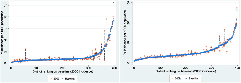
Figure 4. Incidence change plot at district level.
Plot showing the differences in malaria incidence per 1000 population (y-axis) between the baseline year (2006) plotted as blue triangles and incidence for 2009 (hollow red circles). The x-axis represents districts (n = 398). The positive change denoting increase in plotted vertically upwards from the baseline year while negative denoting a reduction in incidence is vertically downwards from the baseline with the length indicating magnitude of change. Overall percentage change for P. vivax was 3.0 and 5.9 for P. falciparum.

