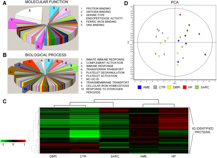
Figure 2. Protein classification and study group clustering.
Classification of the proteins for the different gene ontologies: (A) molecular functions and (B) biological processess. The groups including ≥4 proteins from the set are depicted in the picture. (C) The hierarchical clustering of the study groups is displayed in the form of a heatmap. A dendrogram at the top of the heatmap represents a hierarchy of studied groups based on the degree of similarity in their protein expression. The heatmap shows the mean of a proteińs expression on all analysed spot maps in that particular experimental group. The protein expression levels of 63 identified proteins in the study groups are compared to levels of internal standard, red colour indicating upregulation and green colour indicating underregulation. Data clustering is based on Pearson distance (Pearson correlation, average linkage). (D) The clustering of the spot maps according to the variance of their protein expression was performed with principal components analysis. The first principal component (PC1) explained 59.8% of the variance and the second (PC2) 12.8%. Cumulative variance 90% was reached after 7 components.

