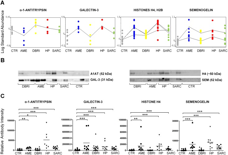
Figure 3. Immunoblot validation of protein markers in BAL.
(A) Differential expression analysis based on DeCyder data for chosen protein markers. Every dot indicates the identified protein spot and its expression level in that particular study group. The difference in protein expression (average expression) between the groups is visualized with a continuous curve. Histone and semenogelin plots contains more than one curve due to several protein spot identification for histones H4, H2B (n = 3) and semenogelin I (n = 2) as shown in Table S1. (B) Images of immunoblot membranes and (C) immunoblot based validation results for protein markers. The number of samples in validation: CTR n = 19, AME n = 7–9, DBRI n = 17, HP n = 9, SARC n = 8. The means (black lines) are shown in scatter plots. *Indicates statistical significance, which is shown between experimental and control group, at the level of p≤0.05, **p≤0.01 and, ***p≤0.001.

