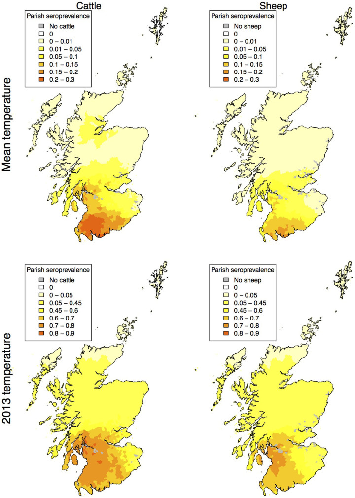
Figure 4. Map of SBV seroprevalence as a proportion of animals infected (averaged over 1000 model iterations) when there is a vector preference for feeding upon cattle rather than sheep.
Maps are shown for mean temperatures (top) and temperatures experienced during 2013 (bottom). Maps created using R33,34.

