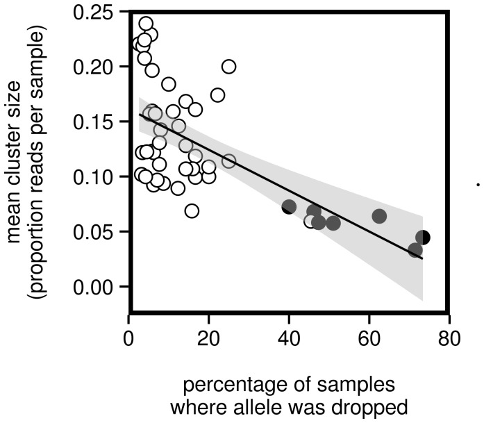
Figure 4. Negative correlation between average cluster size and frequency of dropping.
Each point indicates a single allele. Only alleles that were dropped in at least one sample are plotted (n = 43). Cluster size is calculated as the average of the proportion of reads represented by the allele among all samples containing the allele. The solid line indicates the best-fit linear regression. The 95% confidence band for the regression is indicated in gray. Alleles associated with the “divergent” allele cluster (see Figure S2) are filled in black.

