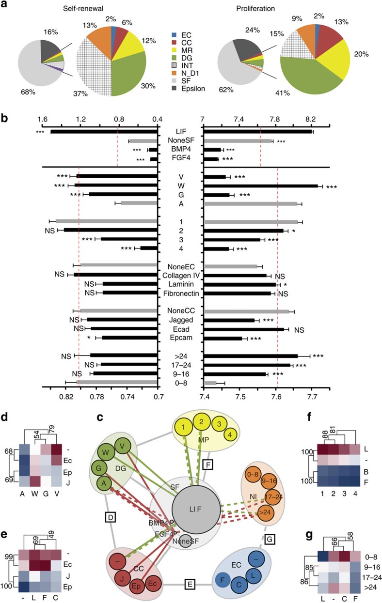
Figure 3. Systems-level analyses at multiple scaling levels.
(a) Role of factor categories and (b) of individual factors within categories in overall response. Grey bars represent baseline or control condition and dashed red line represents overall mean. (c) Network interaction map for significantly interacting categories. Grey lines indicate interactions shared by both area and GFP intensity, while green lines represents interactions present only for GFP intensity. Interactions having the most (green) and least (red) effect on proliferation (solid line) and self-renewal (dashed line) are indicated (top and bottom five interacting partners per category). (d–g) Examples of all pairwise interactions between two categories are shown as clustered heat maps, with minimum and maximum values within each heat map defining the colour range. (d–f) Interactions for area and (g) GFP intensity. Numbers along cluster branches indicate support level. Error bars represent s.e.m. V, W, G, A: degradabilities in decreasing order of MMP sensitivity; –, L, C, F: none, laminin, collagen, fibronectin; 1, 2, 3, 4: mechanical properties categories, in increasing stiffness; NI: number of cells per well at Day 1. Error bars represent s.e.m. All pairwise differences were computed using the Tukey–Kramer method. ***P<0.001, **P<0.01, *P<0.05.

