
Figure 10.
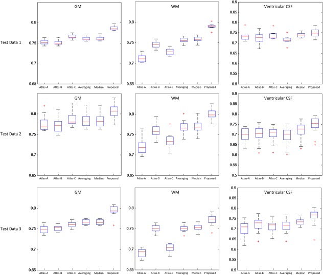
Box plot of the Dice Ratio for the proposed atlas, as well as each of other five comparison atlases. Red lines in the boxes denote the medians, whereas boxes extend to the lower‐ and upper‐quartile values (i.e., 25% and 75%). Whiskers extend to the minimum and maximum values in one‐and‐a‐half interquartile range. Points beyond this range are the potential outliers and thus marked by red “+” symbols. Note that the ventricular CSF was obtained by applying a topological mask [Shi et al., 2011a]. [Color figure can be viewed in the online issue, which is available at http://wileyonlinelibrary.com.]