Figure 1.
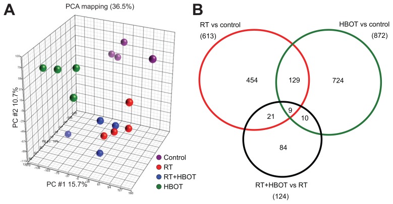
Summary of microarray data by PCA and Venn diagrams. (A) PCA-mapped scatter plot. The global gene expression profiles of the submandibular glands for different treatment groups and control analyzed by PCA. The figure represents the first three principal components of microarray analysis data (PC1, PC2 and PC3) in x, y and z axes, respectively. (B) Venn diagram that represents the number of differentially expressed Affymetrix probe sets in RT versus control (red circle), HBOT versus control (green circle) and RT + HBOT versus RT (black circle), with the number overlapping probe sets inside the circles.

