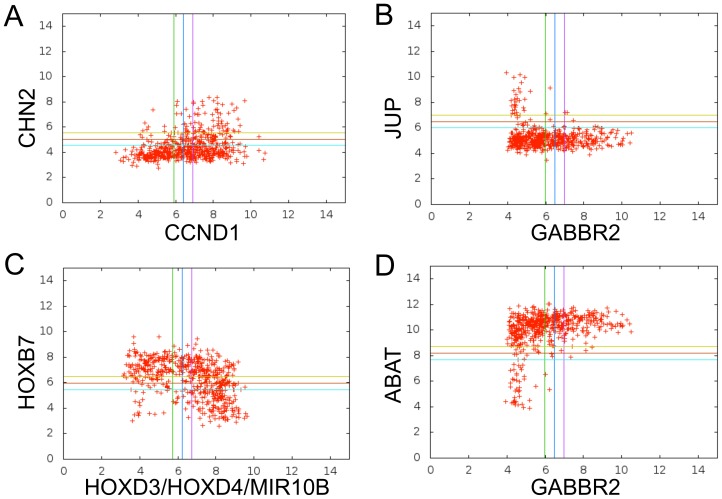
Figure 1. Boolean Implications illustrated using data from gene expression arrays.
Each variable has a threshold, represented in the plot as a blue line, that divides the variable into “low” and “high” levels. The green and purple lines are −0.5 and +0.5 away from the threshold on the X axis, respectively. Samples that fell between the green and purple vertical lines on the X axis and between the yellow and blue horizontal lines on the Y axis were not considered during the generation of a Boolean implication. Each point in the scatterplot represents the values of two variables in a tumor sample. Four L-shaped relationships of gene expression are shown (left-to-right and top-to-bottom) (A) LOLO (if CCND1 is low, then CHN2 is low), (B) HILO (if GABBR2 is high, then JUP is low) (C) LOHI (if HOXB7 is low, then HOXD3 is high) (D) HIHI (if GABBR2 is high, then ABAT is high). A Boolean implication exists between two variables when one quadrant is very sparse. Boolean implications can capture L-shaped relationships as well as linear relationships (in which case the two opposite quadrants are sparse), revealing many associations not found by other methods.

