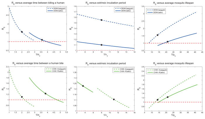
Figure 4.
These plots show how the
 for dengue (top 3 plots) and chikungunya (bottom 3 plots) change as the parameters vary (one at a time) within the ranges given in Table 2, while all other parameters are set at baseline values. Baseline values for the models (indicated by a *) correspond to Table 6. The local sensitivity indices in Table 6 are the scaled slope at the baseline values. For sensitivity curves close to a straight line (e.g. for νv), the local sensitivity index is relatively accurate across the parameter range. However, if the sensitivity curve is more nonlinear (e.g. for σv), the local sensitivity index is indeed only accurate locally. Effective early mitigation strategies target the control POI that reduce
 the most.

