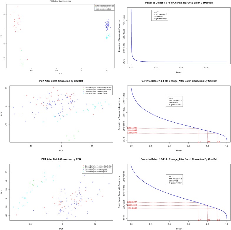
Figure 3. Data Attributes Before and After Batch-Correction.
Samples are depicted as colored dots in PCA plots, “red” and “green” colored dots represents cancer and control samples, respectively, from Ambatipudi et al., 2012, whereas “blue” and “cyan” colored dots represents cancer and control samples, respectively, from Peng et al., 2011. The plots (a) and (b) are PCA and Power distribution plot for dataset before batch correction. The plots (c) and (b) are PCA and Power distribution plot for dataset after batch correction by ComBat. The plots (a) and (b) are PCA and Power distribution plot for dataset after batch correction by XPN.

