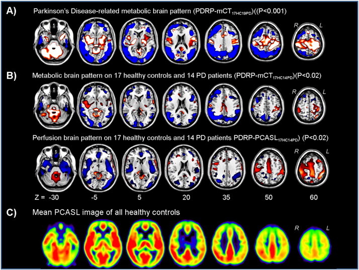
Fig. 1.

A) (T) Map of the Parkinson's disease (PD)-related metabolic brain patterns by using 17 healthy controls (HC) and 19 PD (PD) patients (PDRPmCT17HC19PD). The map was overlaid on a T1 MR template. Relative metabolic decreases (blue) and increases (red) compared to the control group are thresholded at T = 3.7–6.7 (p = 0.001). Seven transversal slices through the brain are shown.B) (T) Maps of the PD-related metabolic and perfusion covariance brain patterns (PDRP-mCT17HC14PD and PDRP-PCASL17HC14PD) calculated by using the same HC and PD subjects and overlaid on a T1 MR template. Relative metabolic and perfusion decreases (blue) and increases (red) compared to the control group are thresholded at T = 2.5–5.0 (p = 0.02). Seven transversal slices through the brain are shown.C) Example of the mean PCASL images of all healthy controls. Seven transversal slices through the brain are shown. Yellow/red = high perfusion, black/blue = low perfusion.
