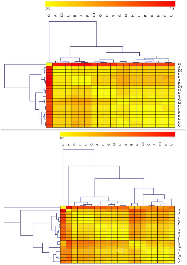
Figure 3. Heat maps of initial δ13Ccol (top) and δ15Ncol (bottom) values by laboratory.
Each entry in the matrix depicts the difference in values obtained between the given pair of laboratories. The key is provided at the top – large differences are red, and minimal differences are yellow. Rows and columns have been clustered in order to place similar laboratories near each other (clusters are indicated by the trees above and to the left of the heat maps) – see Methods.

