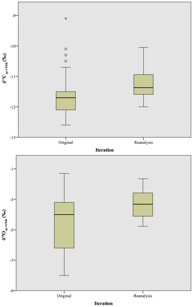
Figure 10. Boxplot comparison of δ13Cap (top) and δ18Oap (bottom) values between original analysis and reanalysis on a single instrument.

Box lines represent first quartile, second quartile (median), and third quartile; whiskers at 95% confidence intervals; dots represent weak outliers (more than 2 standard deviations from mean); asterisks represent strong outliers (more than 3 standard deviations from mean).
