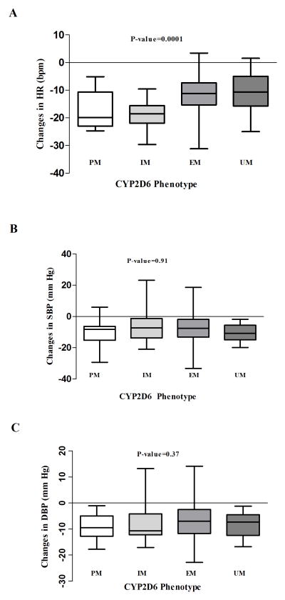
Figure 1. Clinical response to metoprolol therapy by CYP2D6 phenotype.
Figure 1A. Comparison of the changes in heart rate (HR) from baseline by CYP2D6 phenotype. The bottom and top of the box represent 25th and 75th percentiles, the band in the middle represent the median (50th percentile), The lower whisker represent the minimum value of the data while the upper whisker represents the maximum value of the data (ANOVA p-value)
Figure 1B. Comparison of the changes in systolic blood pressure (SBP) from baseline by CYP2D6 phenotype. The bottom and top of the box represent 25th and 75th percentiles, the band in the middle represent the median (50th percentile), The lower whisker represent the minimum value of the data while the upper whisker represents the maximum value of the data (ANOVA p-value)
Figure 1C. Comparison of the changes in diastolic blood pressure (DBP) from baseline by CYP2D6 phenotype. The bottom and top of the box represent 25th and 75th percentiles, the band in the middle represent the median (50th percentile), The lower whisker represent the minimum value of the data while the upper whisker represents the maximum value of the data (ANOVA p-value)

