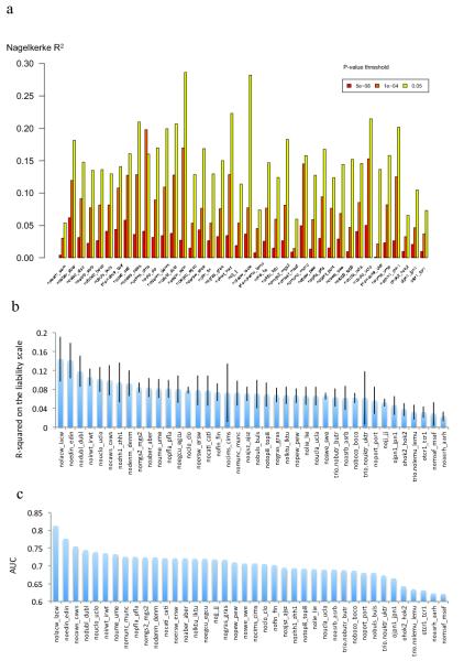
Extended Data Figure 6. Risk Profile Score Analysis.
We defined 40 target subgroups of the primary GWAS dataset and performed 40 leave-one-out GWAS analyses (see Supplementary Material) from which we derived risk alleles for RPS analysis (X-axis) for each target subgroup. a) The proportion of variance explained (Y-axis; Nagelkerke’s R2) was computed for each target by comparison of a full model (covariates + RPS) score to a reduced model (covariates only). For clarity, 3 different P-value thresholds (PT) are presented denoted by the colour of each bar (legend above plot) as for Extended Data Figure 5 but for clarity we restrict to fewer P-value thresholds (PT of 5×10⁻⁸, 1×10⁻⁴, and 0.05) and removed the significance values. (b) The proportion of variance on the liability scale from risk scores calculated at the PT 0.05 with 95% CI bar assuming baseline population disease risk of 1%. (C) Area under the receiver operating curve (AUC). All numerical data and methods used to generate these plots are available in Supplementary Tables 6, 7, and Supplementary Text.

