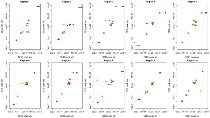
Figure 2. Synchrony in peak timing between the 3 surveillance systems, IMS-ILI, CDC-ILI, and CDC laboratory-confirmed virus activity, by region.
Red symbols illustrate the comparison between IMS-ILI (y-axis) and CDC laboratory surveillance (x-axis); while green symbols represent the comparison between IMS-ILI (y-axis) and CDC-ILI (x-axis). Dots represents 6 pre-pandemic seasons, 2003–04 to 2008–09; squares represent the spring 2009 pandemic wave, and triangles the main pandemic wave in fall 2009.

