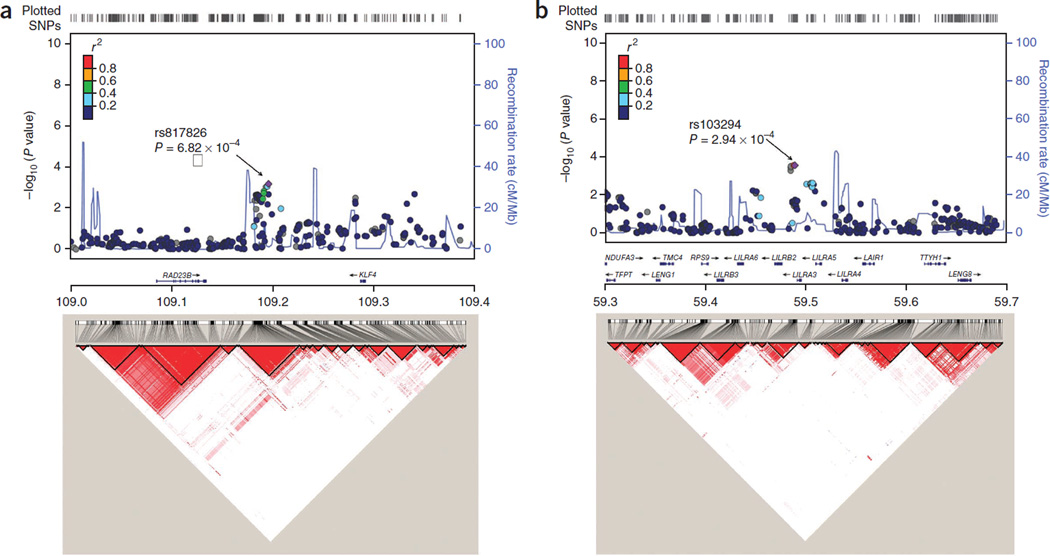
Figure 1.
Regional association plots. (a,b) Regional plots (top) and LD maps (bottom) at 9q31.2 (a) and 19q13.4 (b). For regional plots, association of individual SNP is plotted as –log10P against chromosomal position. Results for both genotyped and imputed SNPs are shown. Symbol colors represent the LD of the SNP with the most significant SNP at each locus (purple diamond). The right y axis shows the recombination rate estimated from 1000 Genomes Project CHB and JPT data. LD maps were based on D′ values using CHB and JPT genotypes from the 1000 Genomes Project (Phase 1 integrated data version 3, released March 2012).

