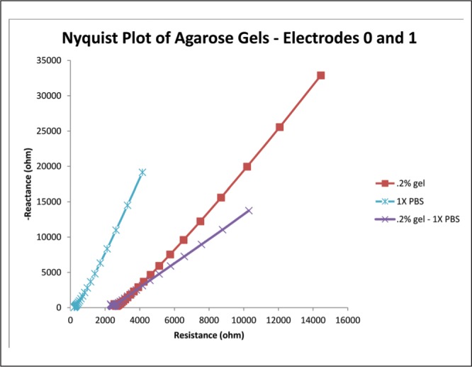
Fig. 14:

Copy of Figure 8, except the 0.6% concentration curve has been removed and another curve has been added. This curve represents the difference between the PBS and 0.2% concentration curves. This provides a decent approximation of what the “tissue component” of the gel impedance looks like, assuming that the PBS curve accurately represents the “electrode component.”
