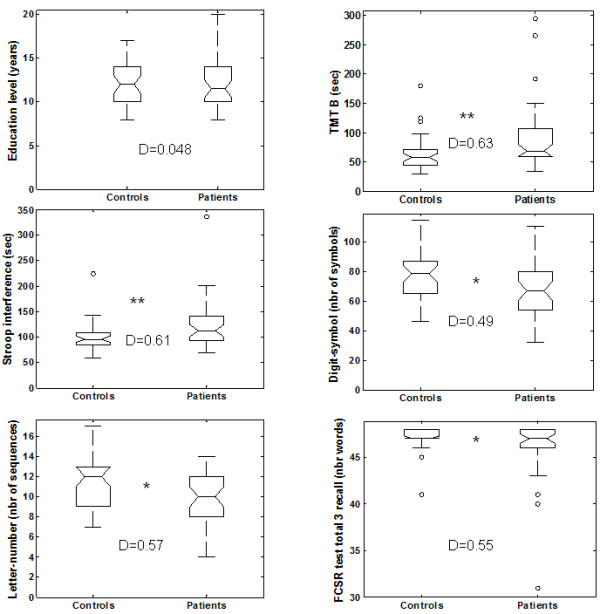
Figure 1.

Group comparisons for education level and the five cognitive tests that showed significant differences. For the main measure of each test, we provide a graphical representation of the dispersion of the performance of each group using box-plots. Boxes represent the 25th and 75th percentiles, and the lines in the boxes indicate the medians. Notches display the variability of the median between samples. Upper and lower lines of whiskers represent minimum and maximum performance. Circles are outliers in each group, i.e. subjects whose performance fell outside minimum or maximum values of +/- 1.5 the difference between the 25th and 75th percentiles. D represents Cohen’s D value. *indicates a significant difference (*: p < 0.05 and **: p < 0.01).
