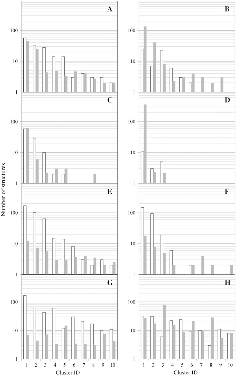
Fig. 5.
Cluster lifetime analysis. The 10 most populated clusters are shown for each simulated system in the following order: (A) wild-type CH3 domain, (B) Q418L, (C) S424T, (D) Q418L / S424T, (E) stem-(0), (F) stem(0), (G) stem-(5), (H) stem(5) (see Table 3). White bars represent how often a cluster was visited in the course of 2 separate 20 ns simulations. Gray bars represent the average lifetime of a cluster, i.e. the average number of snapshots in the simulation observed in the cluster before a cluster switch occurs.

