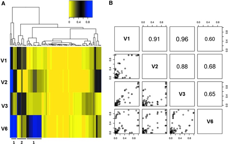
FIG. 3.
Quasispecies variation analysis shows two reciprocally dominant subpopulations depending on the time point during acute infection. (A) Heat map depicting the occurrence frequency of individual point mutations (>1%) across all four time points hierarchically clustered by frequency at all four visits. The heat map follows the color spectrum from yellow (low frequency) to blue (high frequency). Representative mutation clusters for Patterns 1 and 2 are highlighted. (B) Pairwise correlation analysis of the occurrence frequencies of individual point mutations across all four time points further highlighting the two subpopulations reciprocally dominant at V1/V3 versus V2/V6.

