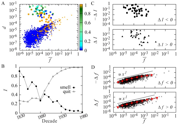
Figure 3. Excursions in frequency and proportion of irregularity in the core vocabulary.
(A) Plot of  against
  (frequency averaged across all the decades) for core roots. Points are color-coded according to their average
  across all the decades. Active roots are represented by larger points, patterning predominantly in the upper “cloud,” distinctly away from stable regular and irregular roots. Some active roots fall into the lower “cloud” (indicated by black circles), due to an effective net
  (i.e.,
  fluctuates below 1 or above 0 between the first and last decade, but has the same value in the first and last decade). (B) Plot of the time evolution of
  for exemplars of irregularization (quit) and regularization (smell). (C) Excursion in irregularity proportion
  (
( when negative) calculated as the difference in
  between the first and last decade plotted against
  for the 69 active roots with a non-zero
  between the first and last occurrences. A negative
  indicates regularization, a positive
  indicates irregularization. The decreasing trend with increasing average frequency corresponds to the behaviour of the “cloud” in (A). (D) Excursion in frequency
  (
( when negative) against
  for all core roots. Red points represents binning of
  and
and  , error bars are given for
  . The trend of
  proportional to
  is visible.

