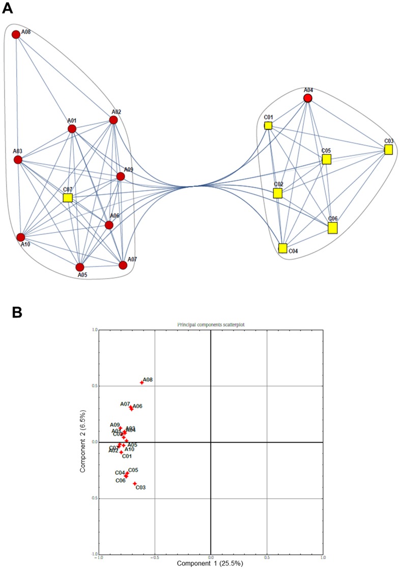
Figure 1. Comparison of global gene expression between controls and pre-therapy patients.
A) Community graphs between controls (C, yellow squares) and pre-therapy (A, red circles) patients. Separation is not complete due to some information overlapping among samples. B) PCA scatterplot. Correlation between controls (C) and pre-therapy (A) patients with respect to the two first principal components computed with the Principal Component Analysis.

