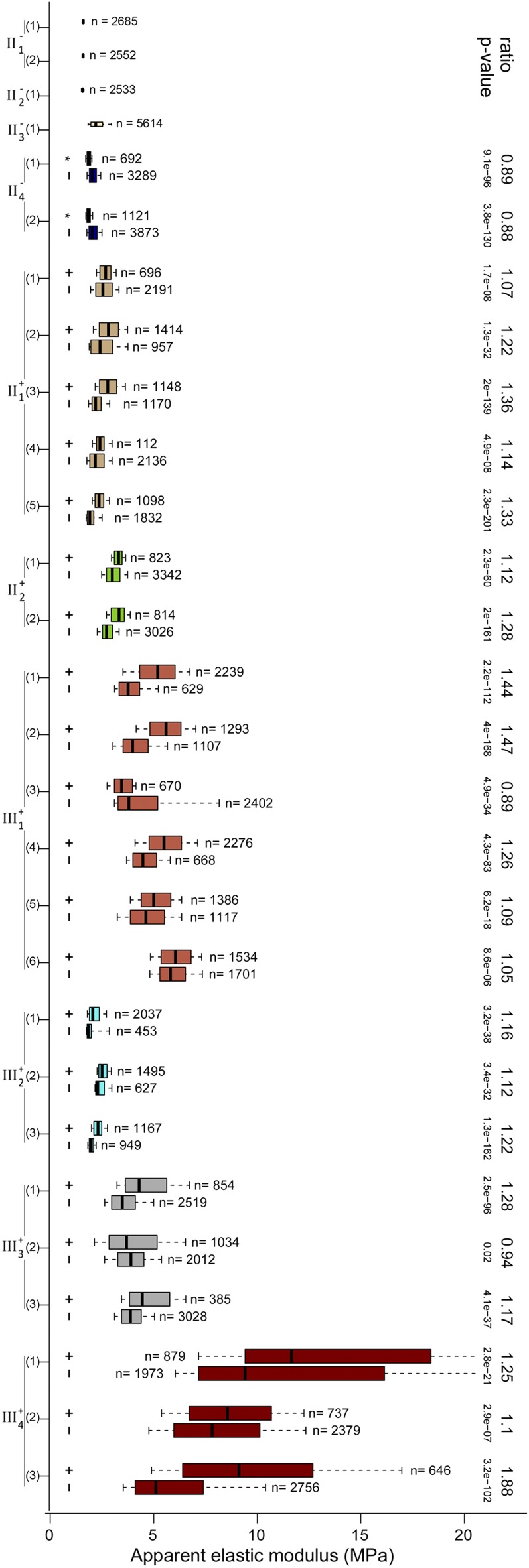
Figure 5.
Distribution of Ea for all the flowers that were analyzed quantitatively. Box-plot representations of the Ea distribution for all maps and groups (GFP+ and GFP−) of each flower are shown. The boxes extend from the first quartile to the third quartile and the whiskers from 10% to 90% of each data set; the number of analyzed pixels is indicated. The ratio between median Ea of GFP+ and GFP− and the corresponding P values (Wilcoxon test; see “Materials and Methods”) are shown where appropriate; the Ea ratio of mother cells of GFP+ cells to mother cells of GFP− cells is also specified for flower II−4 (Fig. 4G). [See online article for color version of this figure.]

