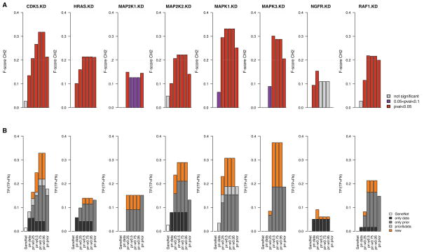
Fig. 5.
Bar plots reporting the performance of gene interaction networks, in cancer cell lines, inferred from genomic data only (GeneNet and predictionet (pn) with prior weight w = 0), predictionet with priors only (prior weight w = 1) and predictionet using combinations of both data sources (prior weight w = {0.25, 0.5, 0.75, 0.95}). Each column reports the performance of the network validated in each KD. (A) Bars represent the F-scores of each network in each validation experiment; they are colored with respect to their significance, that is in red and purple when network’s F-score is higher than 5% and 10% of random networks, respectively. (B) Bars’ heights represent the percentage of true positives with respect to the total number of affected genes for each KD’s network; they are colored based on their origin: black for true positives identified in the network inferred from genomic data only, dark grey from priors only, light grey in both, and orange for true positives that are uniquely found in networks inferred by combining genomic data and priors.

