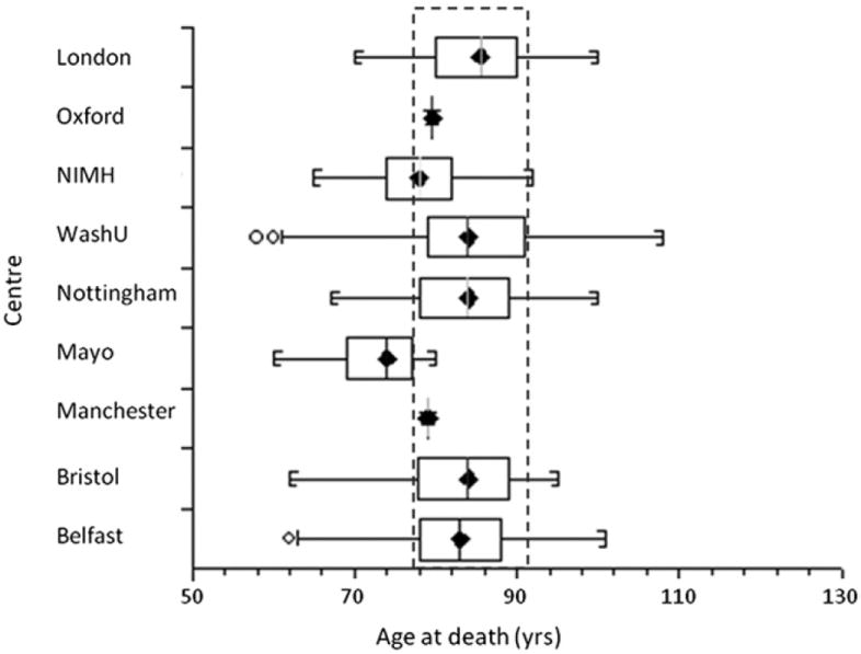
Fig. 3.

Box and whisker plot, showing the age at death (AAD) distribution for each center. The central box represents the distance between the first and third quartiles with the median marked with a diamond. The circles indicate that an individual’s AAD is outside 2 times the interquartile range. The dashed rectangle highlights that the majority of the data have a similar range of AAD with the exception of the National Institute of Mental Health (NIMH) and Mayo data.
