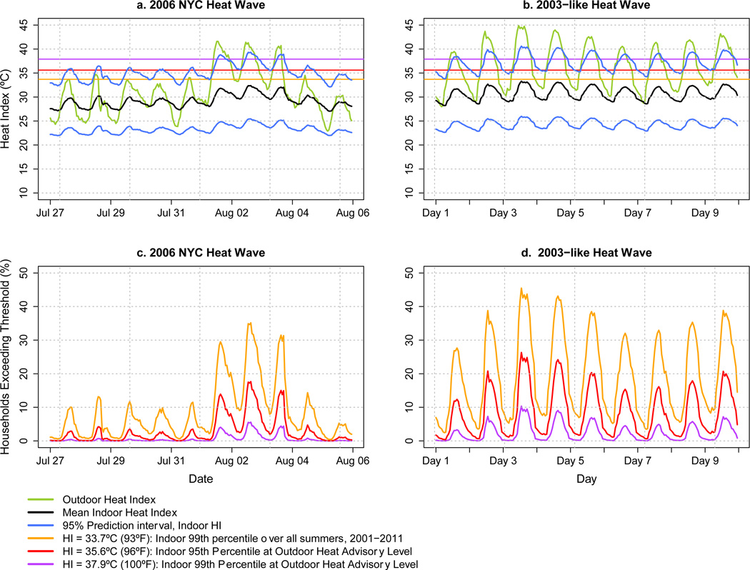
Figure 2. Hourly time series of predicted indoor HI and of predicted HI threshold exceedance during two simulated heat waves.
2a & 2c) 2006 NYC heat wave; 2b & 2d) 2003-like heat wave. Green lines: outdoor HI (observed for 2006, simulated for the 2003-like event). Black lines: mean indoor HI. Blue lines: 95% prediction interval of indoor HI. Purple, red, and orange lines: proposed indoor HI thresholds. Plots 2c & 2d show the percent of households that would exceed each threshold (purple, red, and orange) on an hourly basis during the heat wave. A multilevel regression model with random intercept and slope was used to account for clustering of observations within sites and between-site variability.

