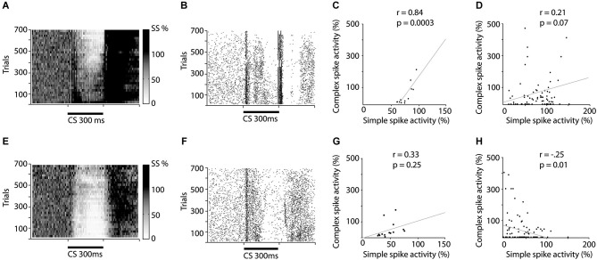
Figure 2.
Raster and scatter plots illustrating training induced changes in simple and complex spike activity. (A–D) illustrates changes in activity during acquisition while (E–H) illustrates changes during extinction. (A and E) Relative change in simple spike firing during training. The darkness of each square represent the average simple spike frequency in that time period, divided by the simple spike frequency 600 ms before CS onset. Each square represents 10 trials and 10 ms. (B and F) Raster plot depicting complex spike activity during training. Each dot represents a complex spike and each row represents one trial. (C and G) Correlation between the average simple spike frequency and complex spike frequency. Each dot represents the relative simple spike frequency 150–250 ms after CS onset, in a 50 trial bin and the relative complex spike activity 200–300 ms after CS onset in the same 50 trials. (D and H) Correlation between un-pooled simple and complex spike firing.

