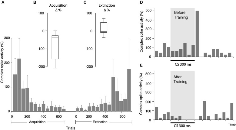
Figure 3.
Changes in complex spike activity as a result of training. (A) Bar chart illustrating complex spike activity (mean ± SEM), relative to complex spike activity before CS onset, in consecutive bins, each consisting of 50 trials. Since all cells were not followed for the same number of trials, the bars representing the beginning of acquisition and extinction are averages of more cells than the bars representing the latter part of the process. Every bar is based on data from at least three cells. (B) Distribution of change in complex spike activity between the first 50 and last 50 trials of the acquisition phase (n = 8). (C) Distribution of the change in complex spike activity between the first 50 and last 50 trials of the extinction phase (n = 9). (D) Bar chart illustrating complex spike frequency in the first 100 trials in the acquisition phase. (E) Complex spike activity in the same cell in the first 100 trials in the extinction phase. Binsize is 50 ms.

