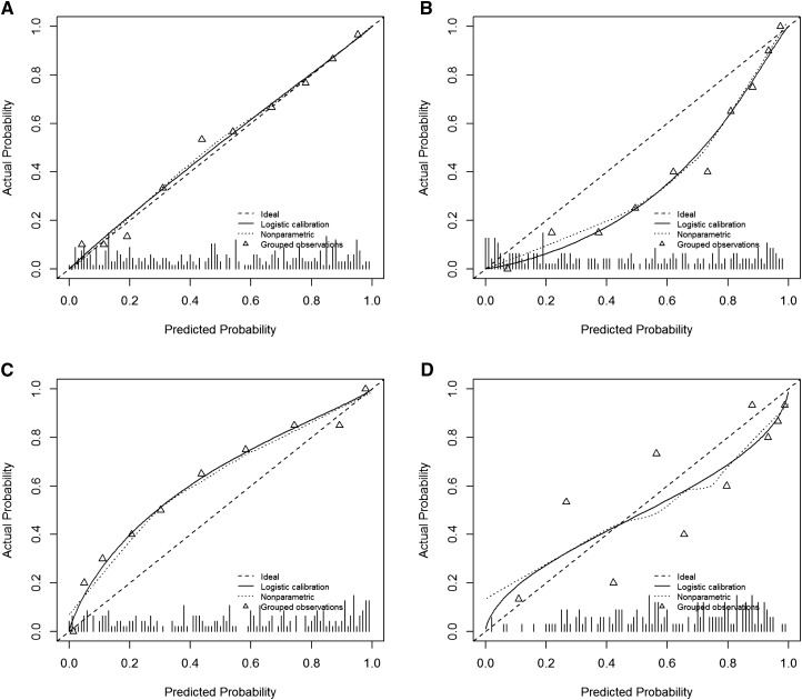
Figure 1.
Calibration plots allow the visual assessment of risk model calibration, a fundamental aspect of model validity. The diagonal line represents the ideal scenario where the actual and predicted probabilities are equal. The triangles are estimates of the actual event rates for groups with similar predicted probabilities. The solid line represents an estimate of the actual event rate for every predicted probability. The hash marks along the horizontal axis show the distribution of predicted probabilities for the dataset. (A) Calibration plot for a well calibrated risk model. Predicted probabilities and observed event rates are nearly identical. (B) Calibration plot for a risk model that tends to overestimate risks. For example, the group of patients with predicted probability of about 0.4 has an event rate<20%. (C) A risk model that tends to underestimate risks. (D) A risk model that is poorly calibrated in a haphazard way, sometimes overestimating risks and sometimes underestimating risks.

