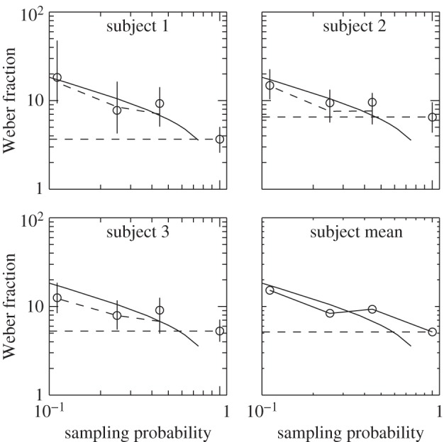
Figure 8.

Results of Experiment 5, in which observers (subjects 1–3) decided whether there are more black than white dots in a display such as figure 7, with a circular mask in front of the display so that only a central circular area was actually visible. The size of the aperture was systematically varied and the observer's accuracy measured as in previous experiments. Weber fractions (vertical axis) for the real observers are shown by circles with 95% confidence intervals (vertical error bars). The continuous curve shows how we would expect the performance of the ideal observer to improve (from left to right in the figure) as we increase the proportion of the 64 dots in the whole pattern actually presented to the observer (horizontal axis). The broken curve shows the performance of a simulated observer presented with the same images as the real observer. By drawing the horizontal line shown in the figure, we can determine that the real observer presented with 64 dots does as well as an ideal observer shown approximately half that number. (Online version in colour.)
