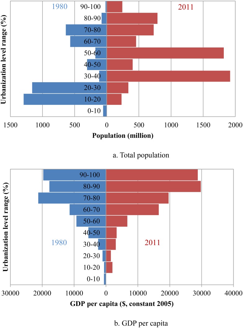
Figure 2. The distributions of total population and GDP per capita by urbanization level.
Applying similar population pyramid methods, the structure of total population and GDP per capita are detailed and compared between 1980 and 2011. The blue represents 1980 and the red represents 2011. (a) shows the total population, and (b) shows GDP per capita.

