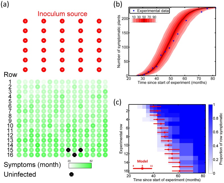
Figure 2. Goodness of fit.
(a) The experimental grove. The red circles correspond to infected mature plants used as initial sources of inoculum, and the green circles correspond to the juvenile plants that were planted at  and that were available to become infected throughout the experiment (the density of shading shows the time at which symptoms emerged on each plant). The mature plants were at
  spacing; the immature plants at
  spacing; the closest distance between the two groups of plants was 5 m. (b) Comparing temporal spread of disease in the experiment with the results from an ensemble of simulation runs: the simulated distribution of the number of symptomatic plants at each time is shown by the density of red shading; the experimental data by blue dots. (c) Comparing spatial spread of disease in the experiment with the results from an ensemble of simulations: the density of blue shading shows the proportion of each row that was symptomatic by any particular time in the experiment; the red horizontal bars summarise the results of simulations. The median time at which the 4th and 11th plants in each row became symptomatic is shown by the end points of each red bar, and the red dot shows the median time at which the
  plant became symptomatic. All times from simulations were rounded up to the next date of sampling in the actual experiment to allow fair comparison with the discrete times of sampling used in the experimental protocol.

