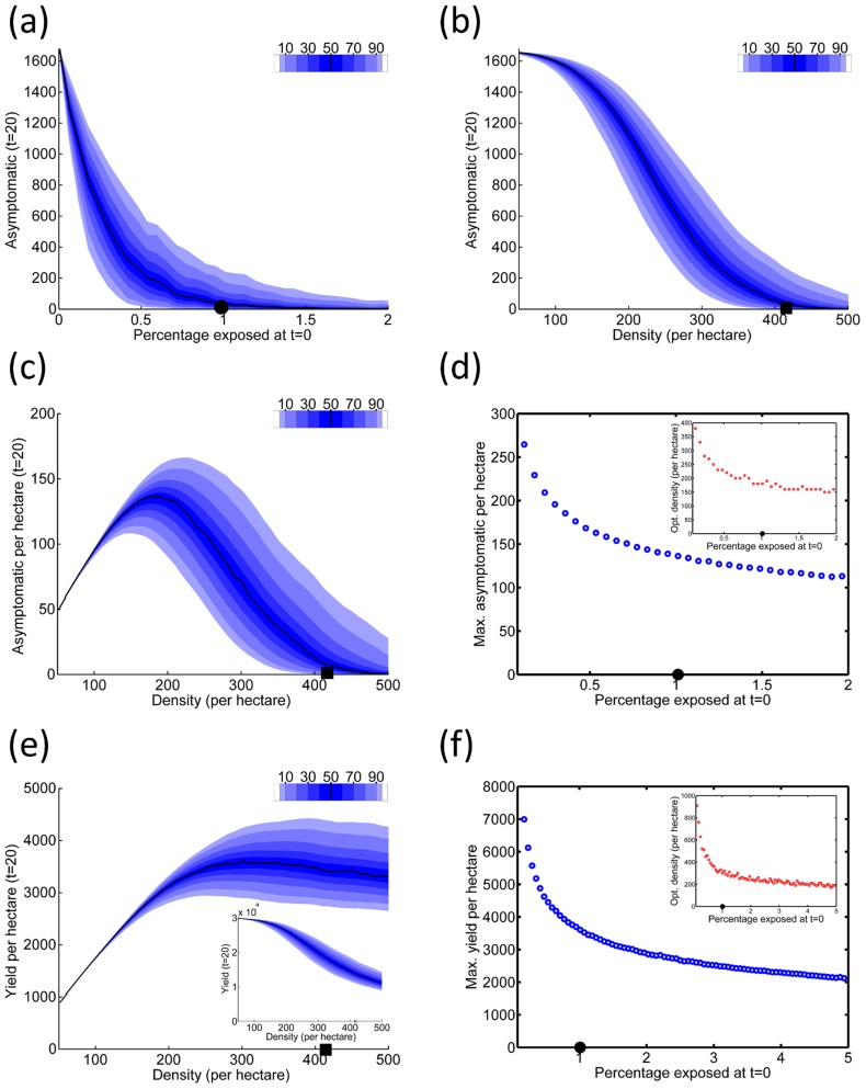
Figure 4. Initial infection and planting density.
(a)  , the number of asymptomatic plants (out of a total of 1680 plants) after twenty years, as a function of the percentage of trees that are infected initially,
  . (b)
. (b)  as a function of the density of hosts, when
  is held fixed at 1%. (c) As Figure 4(b), but showing
  per hectare. (d) The maximum
  per hectare (the inset shows the planting density at which this optimum is attained) for a range of values of
  . (e) The yield per hectare as a function of the density of hosts, when
  is held fixed at 1%. The inset shows the response of the yield before applying the normalisation by area (i.e. the inset is analogous to (b)). (f) The maximum yield per hectare (the inset shows the planting density at which this optimum value is obtained) for a range of values of
  . The black symbols on the x-axis of each graph mark default values that are invariant in other scans (i.e. Figures 4(b), 4(c) and 4(e) have
  fixed at
  ; Figure 4(a) shows results for
  trees per hectare (
 )).
)).

