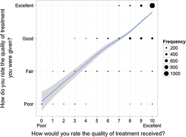
Figure 6.

Correlation of the answers of patients on both scales - Question quality of treatment. Scatterplot for comparison of the answers of each patient on two different answering scales with an overlaid smoother for each item separately. The dots are proportional to the frequency of the corresponding combination.
