
Fig. 1.
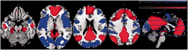
Statistical map of PCC/whole-brain functional connectivity at low frequencies (0.007–0.08 Hz) across all subjects (n = 37: threshold set at uncorrected P < 0.001). Regions in red represent areas that are positively coupled and blue regions represent areas that are negatively coupled with PCC time series. The scale at the top right represents the color coding of the range of t-statistics.