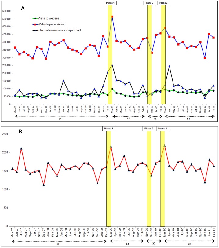
Figure 1. Time series graphs of monthly resource utilisation by the Stroke Association over the study period (May 2007 to February 2011).
A: Absolute numbers of website page views, website hits and information materials dispatched by the Stroke Association. B: Absolute numbers of telephone calls received by the Stroke Association helpline. S1: period before the campaign (May 2007 to Feb 2009). S2: period of no campaign activity after phase one of the campaign (Mar 2009 to Oct 2009). S3: period during phases two and three of the campaign (Nov 2009 to Feb 2010). S4: subsequent period with no campaign activity after phase three (Mar 2010 to Feb 2011). Yellow vertical bars represent the time periods for the different phases of campaign activity.

