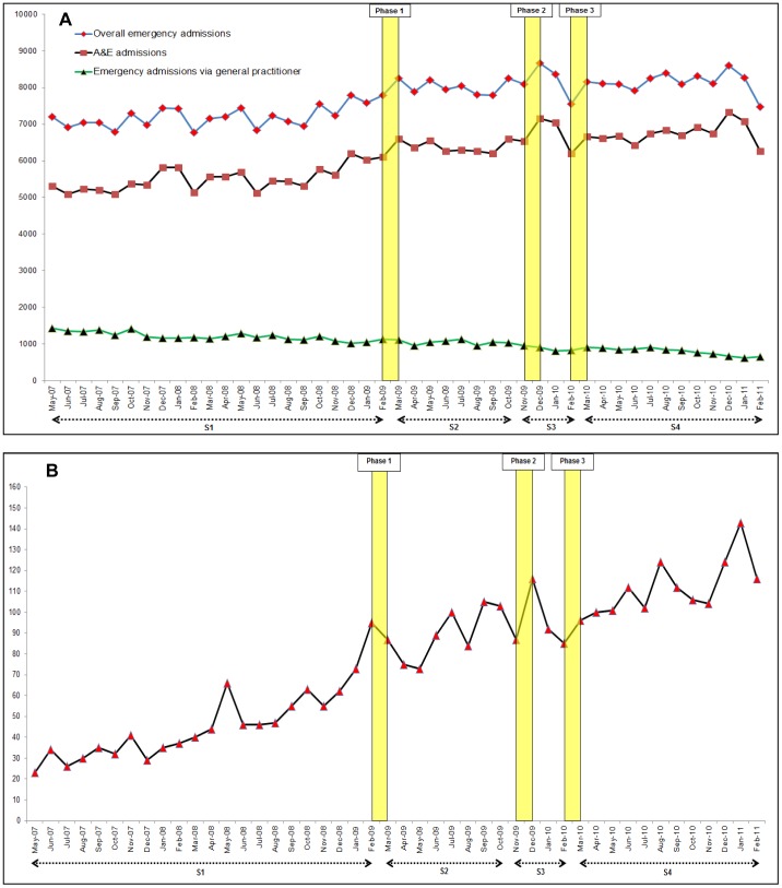
Figure 2. Time series graphs of monthly emergency admissions for stroke and thrombolysis activity over the study period (May 2007 to February 2011).
A: Absolute numbers of emergency admissions with a primary diagnosis of stroke in England. B: Absolute numbers of patients receiving thrombolytic treatment in England (centres that submitted data to the SITS register throughout the study period). S1: period before the campaign (May 2007 to Feb 2009). S2: period of no campaign activity after phase one of the campaign (Mar 2009 to Oct 2009). S3: period during phases two and three of the campaign (Nov 2009 to Feb 2010). S4: subsequent period with no campaign activity after phase three (Mar 2010 to Feb 2011). Yellow vertical bars represent the time periods for the different phases of campaign activity.

