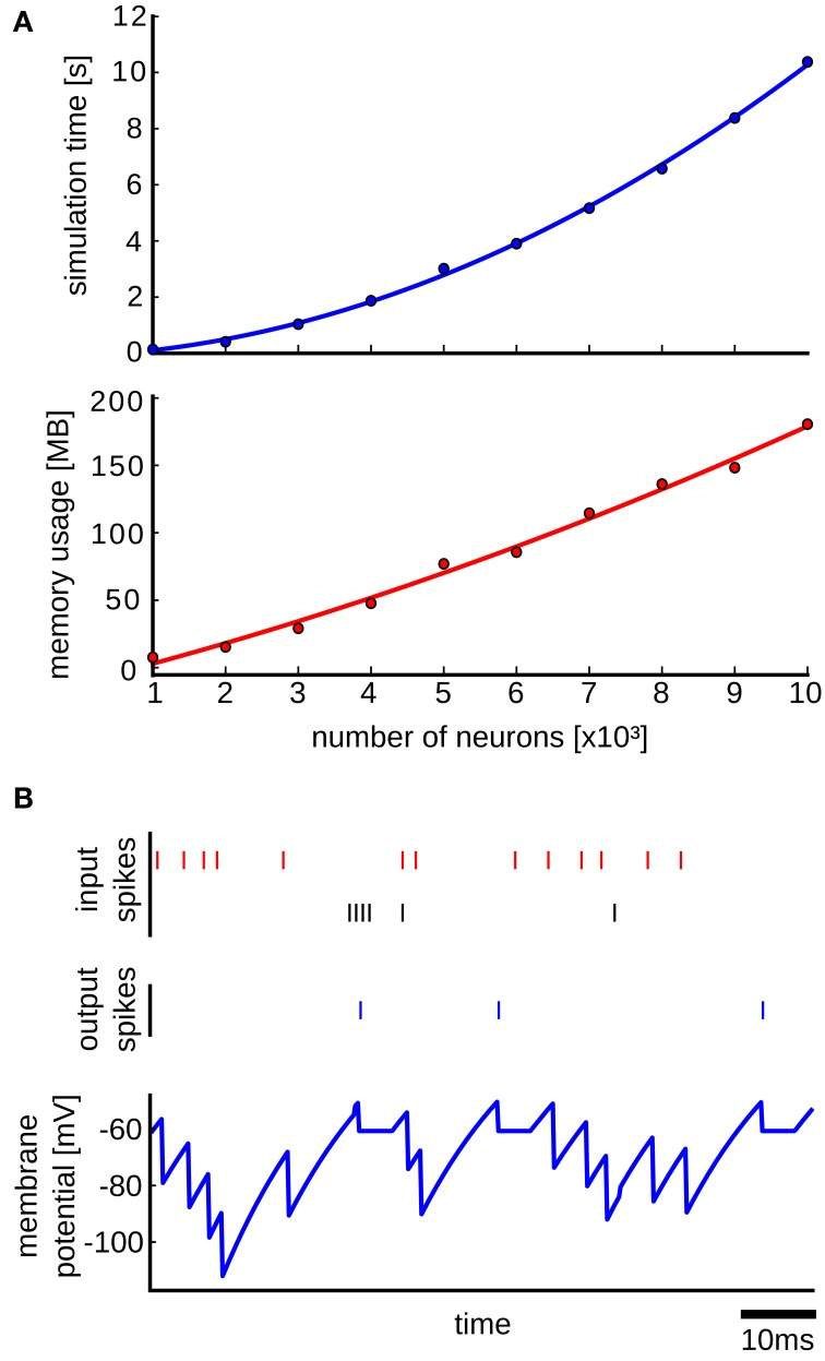
Figure 6.
Results from the simulation with the Benchmark 4 random LIF network from Brette et al. (2007). (A) Upper plot: simulation time as a function of the size of the network. Each point is an average over 10 simulation runs with different randomly generated networks of the same size. The standard deviation was too small and therefore it was not plotted. In each simulation run the network is simulated for 1s of biological time. The blue curve is a quadratic polynomial fit of the data points. Lower plot: same as in the upper plot but here the scaling of used memory with the size of the network is plotted. The red curve is a quadratic polynomial fit of the data points. (B) Simulation of a LIF neuron that receives input spikes from inhibitory (red spikes) and excitatory (black spikes) neurons and produces output spikes (blue) in response. The blue curve shows the membrane potential recorded in the NEVESIM simulation.

