
Figure 3.
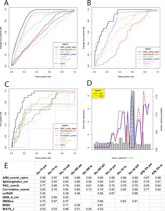
Methods comparison. (A) ROC curves for differential splicing prediction methods using ‘Illumina 75’ data set with all possible pairwise test cases (i.e. comparing one tissue against another tissue). (B) ROC curves assessing tissue-specific splicing events (i.e. comparing one tissue against all others). Due to highly variable sample sizes two methods had to be skipped. (C) ROC curves assessing differential splicing in brain versus liver. (D) Example of a detected true positive splicing event in the gene MPZL1. Exons are shown on the x-axis. RPKM values are visualized with the red dashed line for brain and blue solid line for liver. The splicing probabilities used for the entropy-based prediction are denoted as grey bars. Two exons known for splicing are marked with green dot-dashed lines. (E) AUC values for the different test cases including exon array results (pw = pairwise; ts = tissue specific; b2l = brain versus liver; EA = exon array data).