
Figure 5.
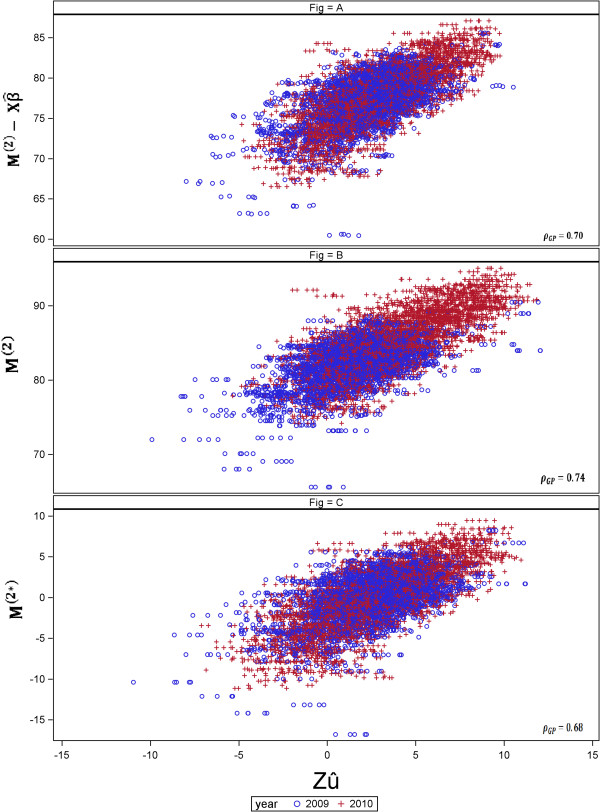
Comparison between approaches to fit the year effect. The y-axis represents the genotype adjusted means  in (A), M
(2) in (B) and M
(2∗) in (C) ] and the x-axis represents the GEBV (
in (A), M
(2) in (B) and M
(2∗) in (C) ] and the x-axis represents the GEBV ( ). (A) Year-wise analysis (Approach 1a), fitting year as fixed effect in the GP stage, (B) Across-years analysis (Approach 2), using year in the second stage and (C) year-wise analysis using the year effect-corrected genotype means (Approach 1b). ρ
GP represents the predictive ability.
). (A) Year-wise analysis (Approach 1a), fitting year as fixed effect in the GP stage, (B) Across-years analysis (Approach 2), using year in the second stage and (C) year-wise analysis using the year effect-corrected genotype means (Approach 1b). ρ
GP represents the predictive ability.