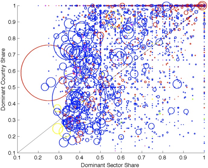
Figure 3. The x and y coordinate of a given circle represent, respectively, the share of firms in the dominant sector and country of a given community.
Moving along the x axes corresponds, for a community, to have more firms from the dominant sector. While moving along the y axes corresponds, for a community, to have more firms from the dominant country. For instance, a circle in the top right area represents a community with a large fraction of firms from one sector and one country. The size of the circles is proportional to the number of firms belonging to the community, while the color to the firm localization country (blue for EU, red for North American, yellow for Asian, green for fiscal paradise and magenta for all the other countries). The fact that most circles are located above the diagonal implies that the country dominance tends to be more pronounced than the sector dominance. This is particularly true for small communities.

