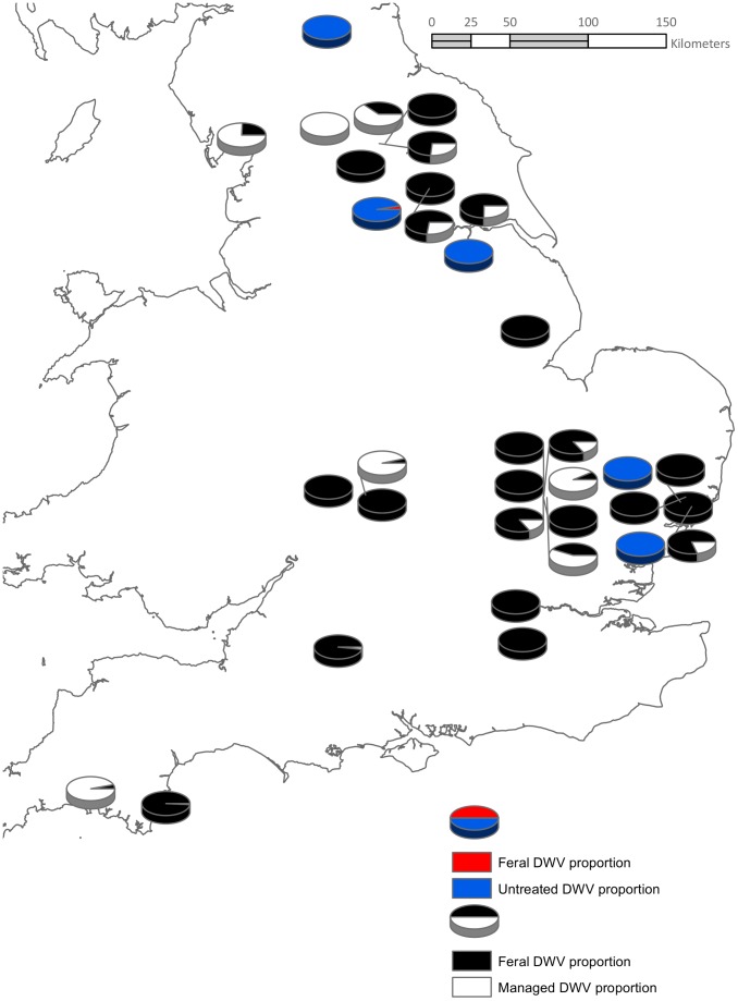
Figure 2. The proportion of DWV between pairs of either feral/managed or feral/untreated managed colony pairs.
The pie charts are split into two groups: the red fill indicates feral colony DWV levels alongside the blue fill for managed colonies where no Varroa treatment was used. The black fill indicates feral colony DWV levels alongside the white fill of Varroa treated managed colonies.

