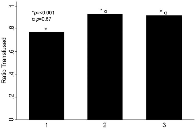
Figure 2.

Bar graph demonstrating the number of single unit transfusions by study period for all open heart surgery cases performed during the study. The x-axis represents the study period while the y-axis represents the ratio of single unit transfusions. The single asterisk marks comparison of all ratios using Chi-square analysis. The α symbol denotes a sub-group comparison of period 2 and period 3 using logistic regression analysis. The associated p values are indicated.
