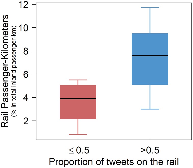
Figure 9. Box plots of the distribution of rail passenger-kilometers expressed in percentage of total inland passenger-kilometers according to the proportion of tweets on the rail among the tweets on the road and rail.
The red color for countries having a proportion of tweets on the rail less than 0.5. The blue color for countries having a proportion of tweets on the rail higher than 0.5.

