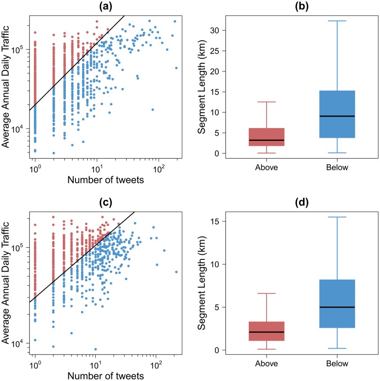
Figure 10. Comparison between the Average Annual Daily Traffic and the number of tweets on the road.
(a)–(c) Comparison between the Average Annual Daily Traffic and the number of tweets on the highways in France (a) and United Kingdom (b). Points are scatter plots for each highway segments. (b)–(d) Box plots of the highway segment length according to the type of segment in France (b) and United Kingdom (d). The red color for the points above the black line and the blue color for the points below the black line.

