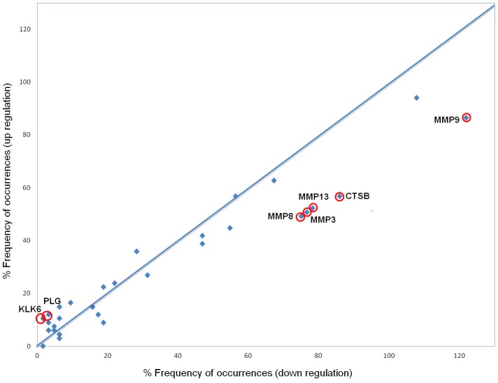
Figure 3. Graphical representation of the frequency distribution of proteases with modified activity associated with RA.
Percentage frequency of peptide occurrences in the down-regulation group is plotted on the x-axis, whereas the percentage frequency of occurrences in the up-regulated group is plotted on the y-axis. Circled data points represent the proteases which activity is the most affected in RA compared to that of healthy controls (see Table 4).

