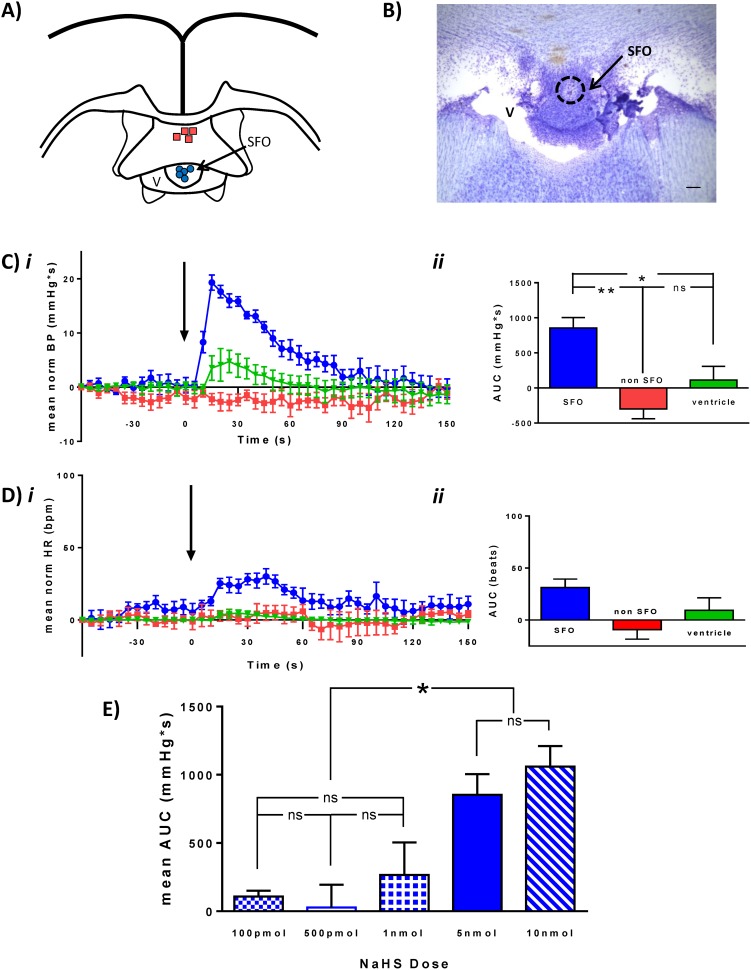
Figure 2. Hydrogen sulfide microinjection into the SFO increases BP.
Individual microinjection locations in SFO (Blue circle) and non-SFO sites (red squares) are illustrated in the schematic (A). The photomicrograph (B) shows one of the SFO microinjection sites (scale bar: 100 µm) C) Normalized mean (±SEM) BP trace (i) and summary graph (ii) illustrating BP change in response to NaHS (5 nmol) injection (arrow) into SFO (blue, n = 5), non-SFO (red, n = 4), or ventricle (green, n = 5). D) Normalized mean HR trace (i) and summary graph (ii) illustrating HR change in response to NaHS (5 nmol) injection (arrow). E) Bar graph illustrating dose-response relationship showing NaHS injections of 100 pmol (boxed), 500 pmol (white), 1 nmol (crossed), 5 nmol (solid), 10 nmol (dashed). Significant differences are indicated by asterisks, *p<0.05. Error bars denote SEM.

