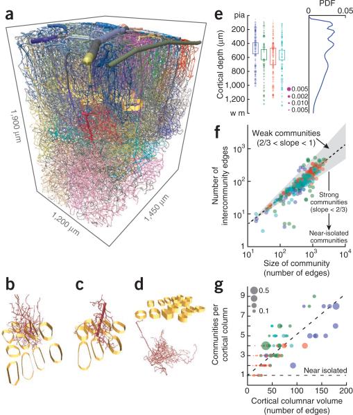
Figure 3.
Community analysis of the global topology of the microvasculature. The analysis makes use of the adjacency matrix for the branches. (a) Views of the complete vectorized vasculature that show different communities, each labeled by an individual color, as well as columnar boundaries (golden bands). (b–d) Representative communities. (e) The distribution of separate communities as a function of depth (362 communities across 4 mice; different colors represent data from different mice). The boxes highlight the extent of layer 4. The area of the dot scales as the size of the community relative to that of each angiome. The PDF on the right was computed by averaging over all examples. (f) Scatter plot of the number of edges between each pair of communities versus the number of branches in the community. The gray region is bounded by power law slopes of 2/3 and 1, and the dashed line is a fit of a power law to the data, with exponent 0.83 ± 0.04 (mean ± 95% confidence interval, found with robust linear regression). (g) Scatter plot of the number of communities that are either encompassed or pass through a cortical column as a function of the size of the column. Size is measured in terms of the number of branches that are either encompassed by or pass through the column. The horizontal line is the expected result when there is one community per column and the dashed line is a linear fit to the data, with slope 0.041 ± 0.004 (mean ± 95% confidence interval). The size of the dot is the fraction of the community that has the largest overlap with a given cortical column.

